I arranged a second home for an American family in Prague, in particular a living room including a kitchen, an entrance area and a bedroom. Most of the project was handled remotely. I met the clients at the end of January when they took over the apartment from the developer. At the first meeting, we discussed the clients’ ideas and pre-selected materials for the kitchen. At the end of June, the apartment was completely furnished except for the decorations and paintings, which we fine-tuned in July.
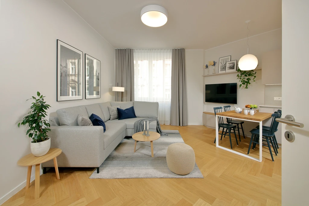
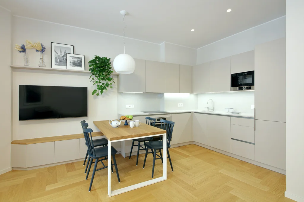
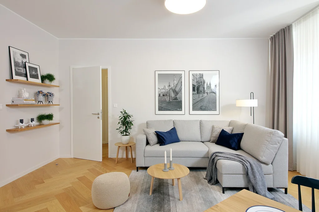
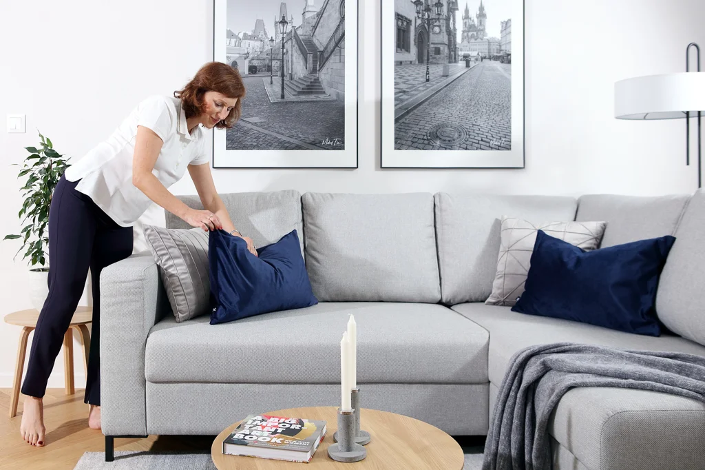
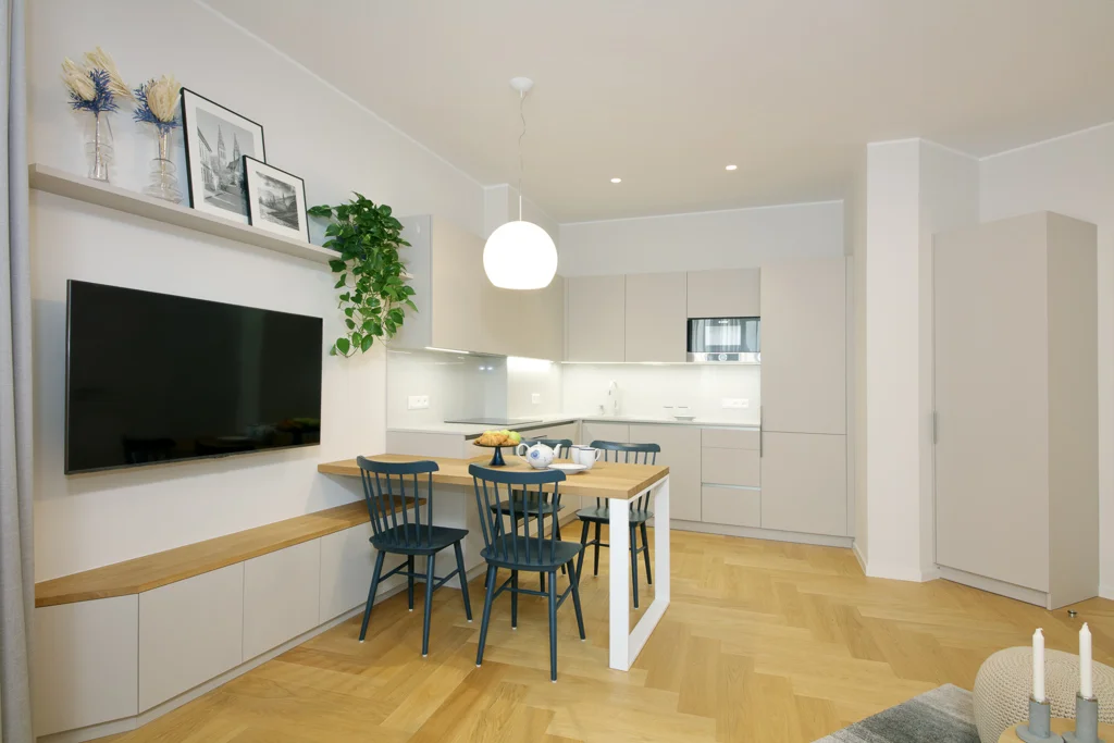
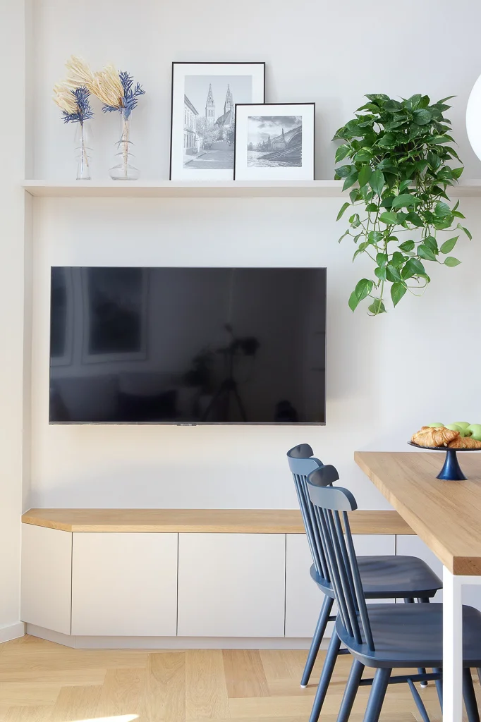
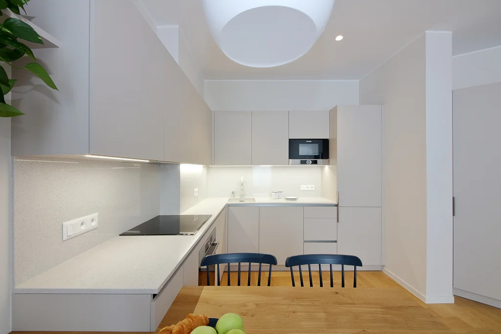
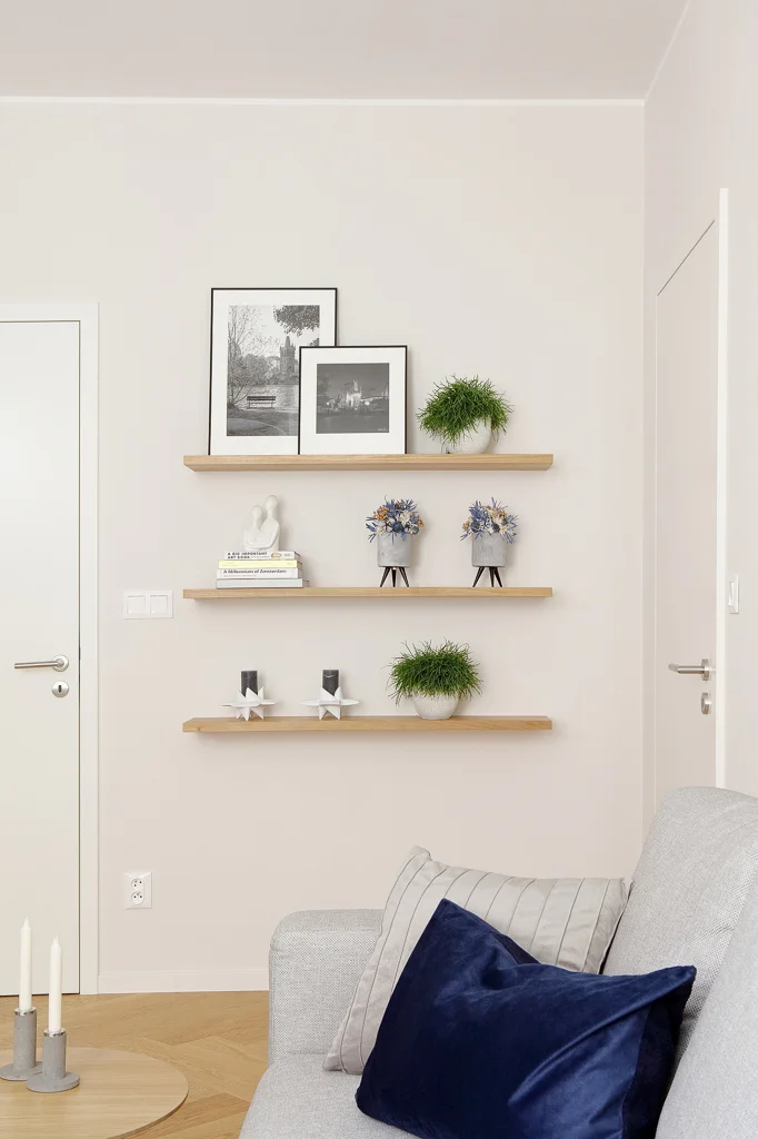
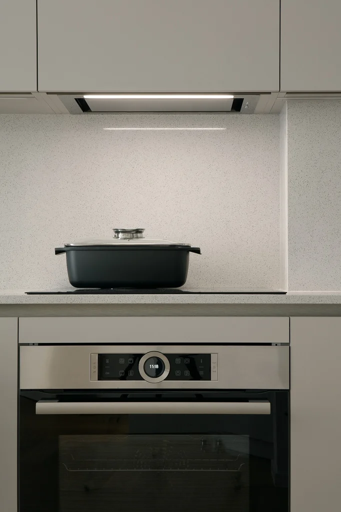
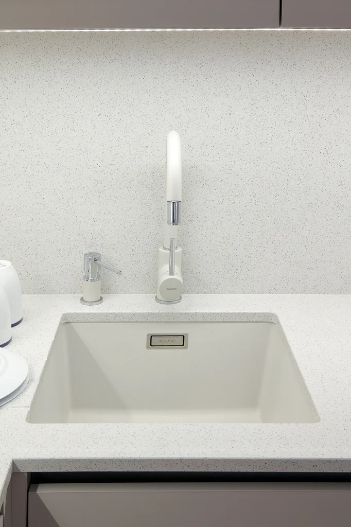
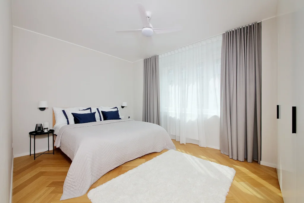
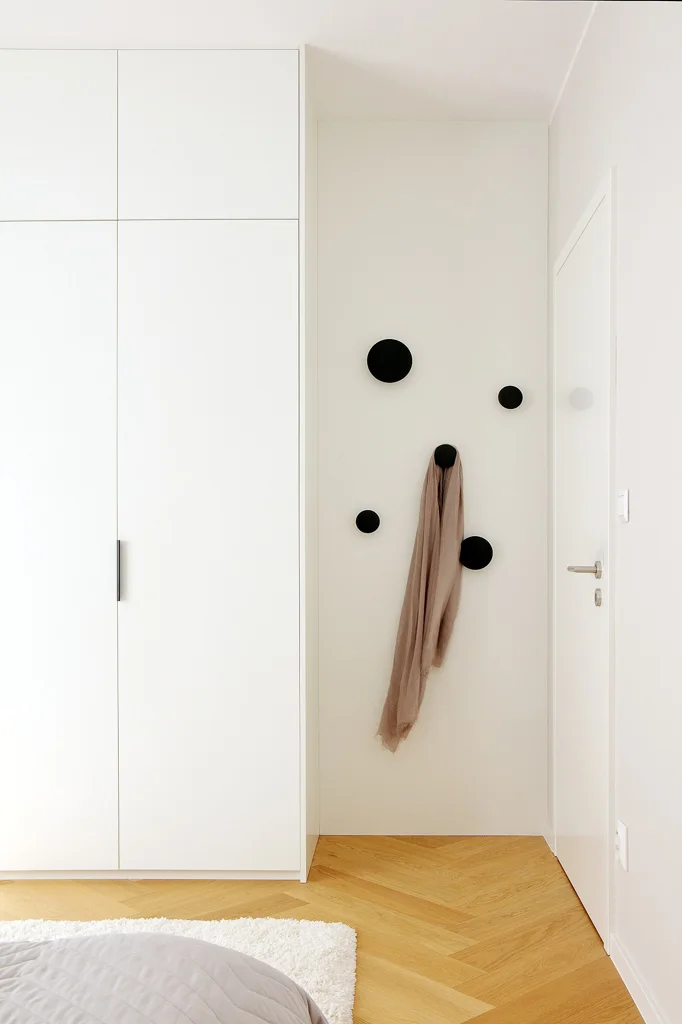
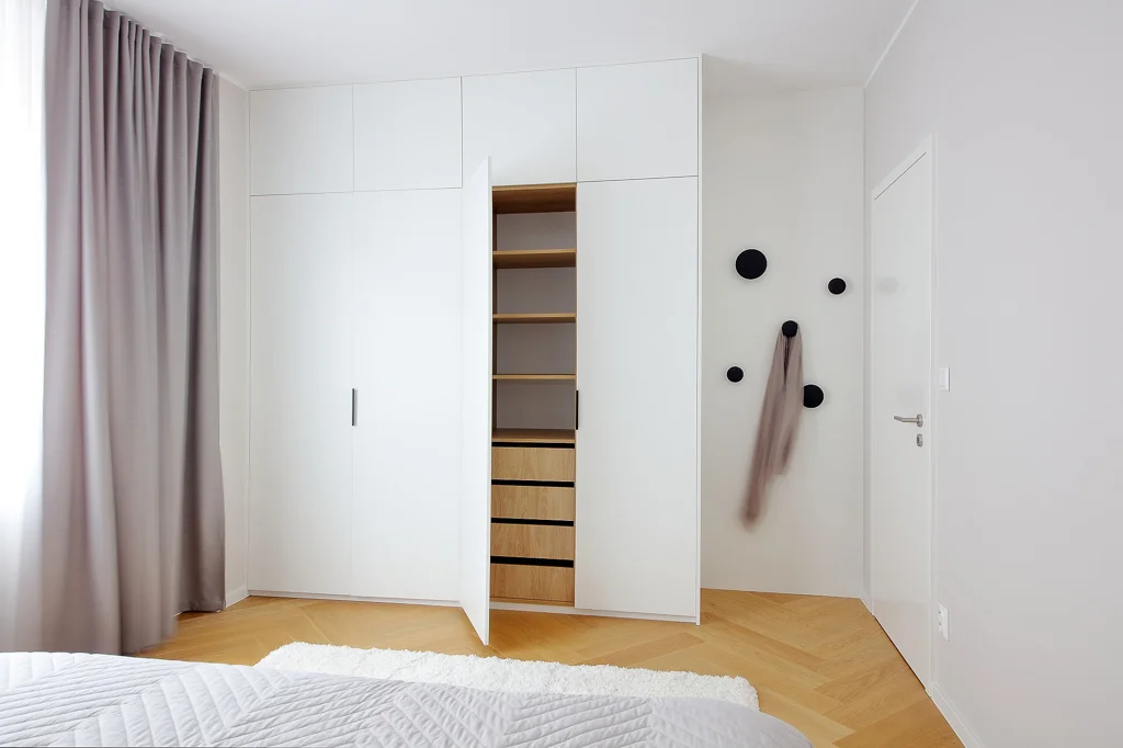
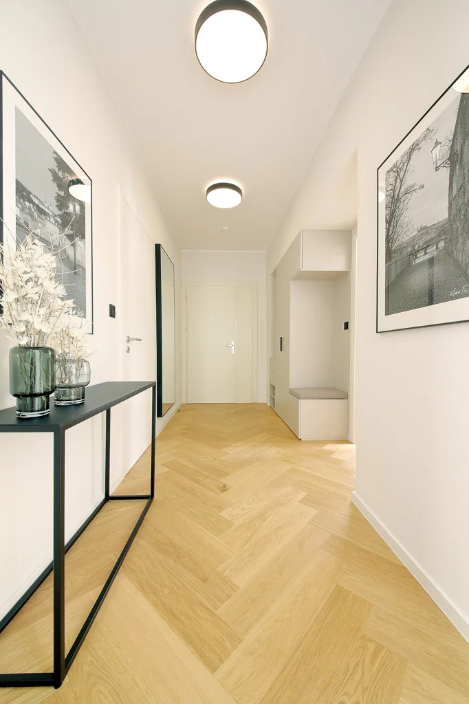
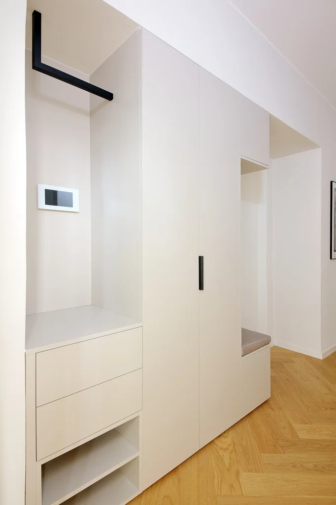
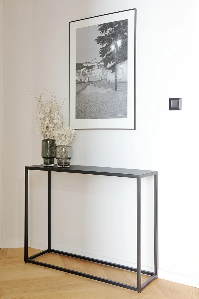
Photo: Robert Žákovič
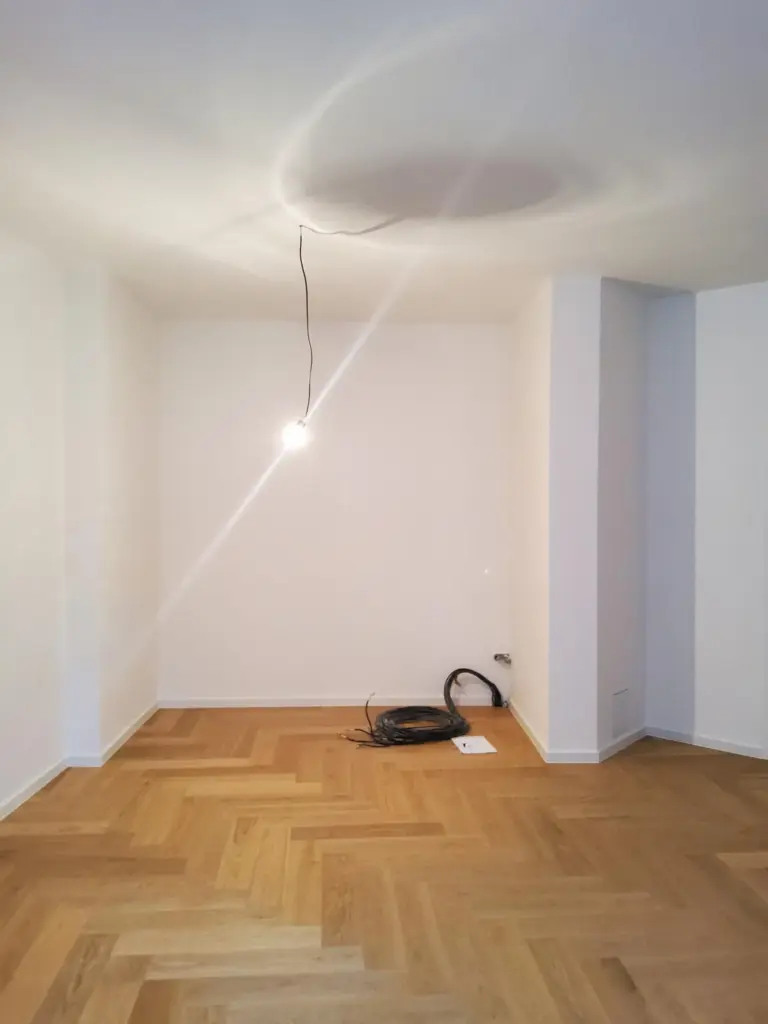
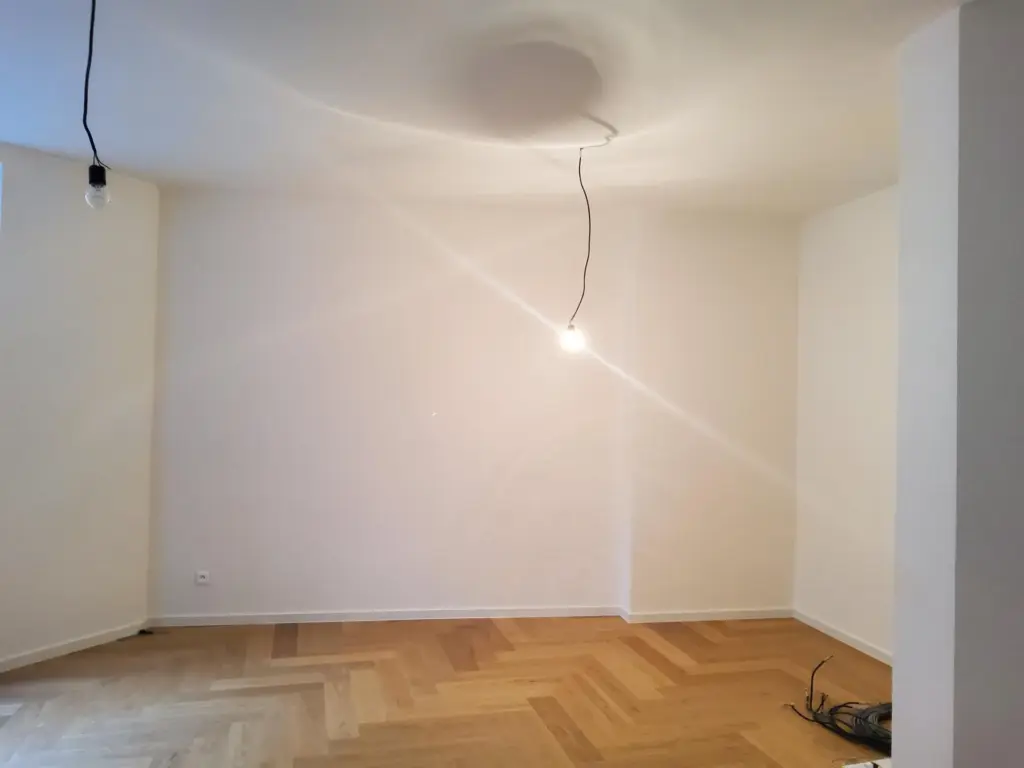
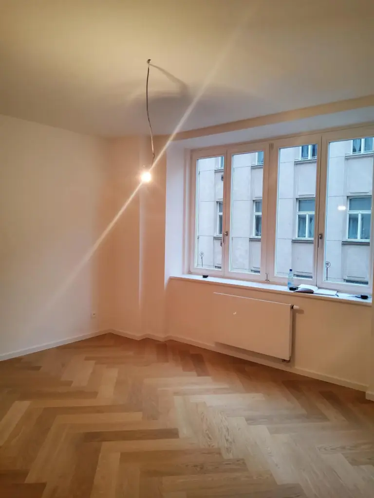
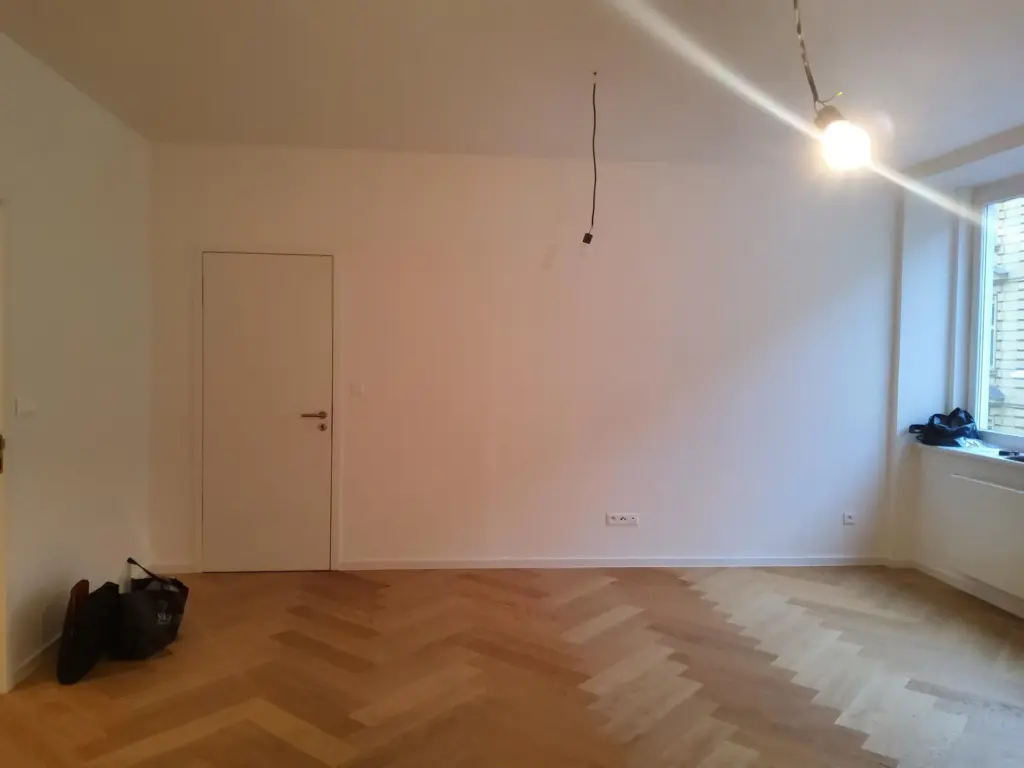
Atypical floorplan of living room and kitchen
The client’s proposition was an airy and light interior, which in of itself was a challenge given a smaller space and the atypical shape of the living room. Apart from the unusual shape, I had to find a creative solution for the niche on one wall, re-do the electrical and water installation and combine dining and TV watching in one space.
Kitchen living room combo
The project was especially specific, with work being done in regards to millimeters. I had to battle with ergonomics so that a full-fledged kitchen could fit into the small space, including a 60 cm dishwasher, stove, oven, microwave, pantry, as well as a dining table, a large TV and a corner sofa. I also had to be careful with placing the TV on the hinged bracket so that it does not interfere with the dining chairs when the TV is extended. Another crucial aspect was the position of the pendant light above the dining table, so that the upper kitchen door does not hit it.
Mix of light grey and beige tones to create airness
When choosing colors and materials, I selected a mix of light shades of gray and beige with a pinch of dark blue. All furniture incl. of the dining table and wardrobe was custom-made. The rest of the interior furnishings are mainly from Czech brands, such as a sofa from the brand Polstrin, a hanging light made of opal glass from the brand Lucis, dining chairs Ironica from Thon, etc. Furthermore, I decorated the interior with photographs of Prague from the photographer Michal Fic.
The clients are excited about the new apartment and praise that they have enough space in the living room and kitchen for cooking, as well as for dining and relaxing; although, the space does not seem cramped at all, but rather airy.
We are delighted to share our experience with Delicato Design and recommend Olina Puchalová without reservation. She took on a challenging job and delivered a flawless product.
The project came with several challenges that required optimizing limited space and working within atypically-shaped areas. The kitchen-living room is an envelope-shaped room that, with the wrong configuration, would have appeared cramped, over-furnished, and cobbled together. Our goal was to keep the area “light and airy” without the kitchen dominating one’s visual profile. We wanted the living room side to appear as an independent space and not just as an appendage to the kitchen. The wrong kitchen cabinet style or color would create an impression that the walls were closing in on the small room. Positioning the appliances (all full-sized in our case) in the wrong places would make the kitchen appear chopped up and overbuilt. And an incorrectly designed eating area would disrupt the visual boundary between kitchen to living areas.
Getting the project right also required a person with the technical expertise to provide contractors with explicit plans for reconfiguring water, electric, and drain connections. Olina works with an uncompromising attention to detail. Her world exists in sub-millimeter units of measurements, and she demands the same of her contractors and tradesmen. Whether it be countertops, cabinets, or built-in closets, the finished product fit-and-finish were impeccable.
Throughout the process, Olina was attentive to our preferences and always accessible when we needed something. She understands the business of remodeling well, stays within budget, and gets the job done on time.
Mark & Jana Rooney
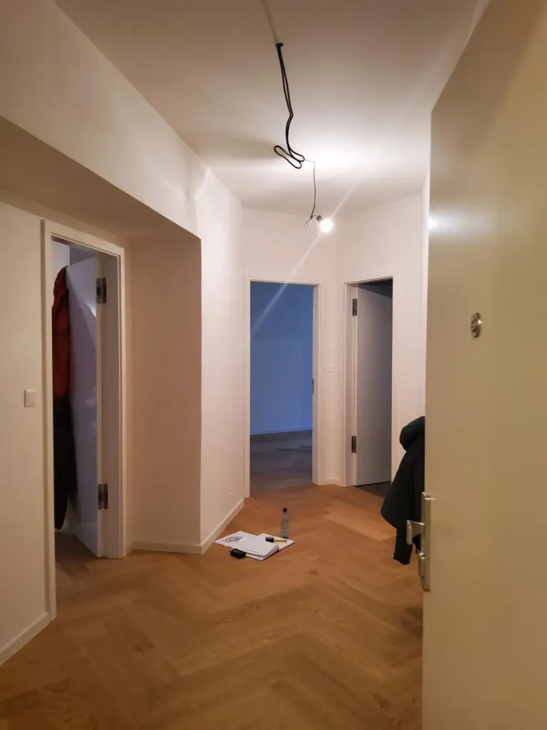
“Before” photos
